How to Create an Underpainting
I am about to convert you into Mark Rothkos and Helen Frankenthalers…
For next Saturday, we will work with an underpainting. I need you to do some preliminary work though: I want you to create 3 or more works of random color using the guidelines below. I want the compositions to be temperature dominant, that is warm over cool OR cool over warm. So, with those guidelines, you will either have 2 warm compositions and 1 cool OR 2 cool compositions and 1 warm. You may do more than 3 if you like - in fact, the more you have, the more selections you will have to choose from. Remember to counter balance with a small bit of the opposite temperature.
Work as large as you can.
But please be advised: THESE ARE NOT FINISHED PAINTINGS. I WILL SHOW YOU HOW TO COMPLETE THEM IN CLASS. Plan on painting in class.
Do not overthink this. This is a fun exercise that should not be restrictive. It should only take you 10 minutes or so for each painting, if that. Oh! And Kelly will remind you to let the painting dry, if you like, to have hard edges on top of soft, wet-in-wet ones.
so…DIVE IN with reckless abandon!
Here are some guidelines:
Work as large as possible; this will free you up and give life to your work.
Let a temperature dominate: use predominately warm colors balanced by a small amount of cool colors - OR - predominately cool colors with a small balancing bit of warm colors.
Don’t try to create recognizable imagery.
Use a mix of hard and soft edges.
Remember to vary sizes and shapes.
Colors that are too soft and pastel-like will not work in this exercise - be a little bold!
With that said, strong, hard-edged shapes can sometimes be too attention grabbing; there is a balance between this and the above.
Remember to leave some white - as in, white of the paper - in the composition.
Use your larger spray bottle to wet the paper and encourage runs. But the paper does not have to be all wet-in-wet - you can use dry brush as well.
Channel your inner Jackson Pollack: Splatter paint! (if you like.) RESERVEDLY. I was just kidding about Jackson Pollack. Just a little here and there - IF you wish - and you don’t have to splatter at all (and your white carpet will thank you.)
Use readily available objects and tools, if you like, to add texture such as combs, credit cards, wadded plastic wrap, use objects as stamps for texture, etc. Be forewarned, however, this kind of stuff can get gimmicky real fast. Use with reserve.
Pattern is fine but remember not to be predictable.
Don’t be obsessed with “pretty”; think “interesting”.
Have fun! Rotate the paper to encourage colors running into one another; use color mingling to “inject” secondary colors into an original wash of color (while it is wet, remember!) Let gravity do its thing!
BRING FRESH PAPER - I may not like what you do and make you do it over. (I will have the hair dryer on hand. Anyone else please bring one as well.

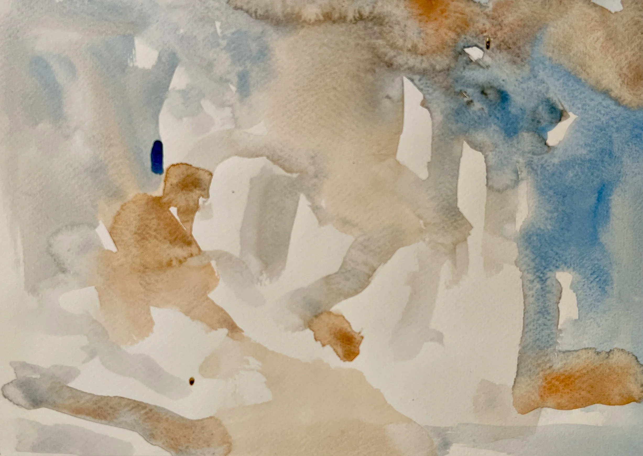
Warm dominates with a bit of cool added. Notice the texture added with a comb-like tool.

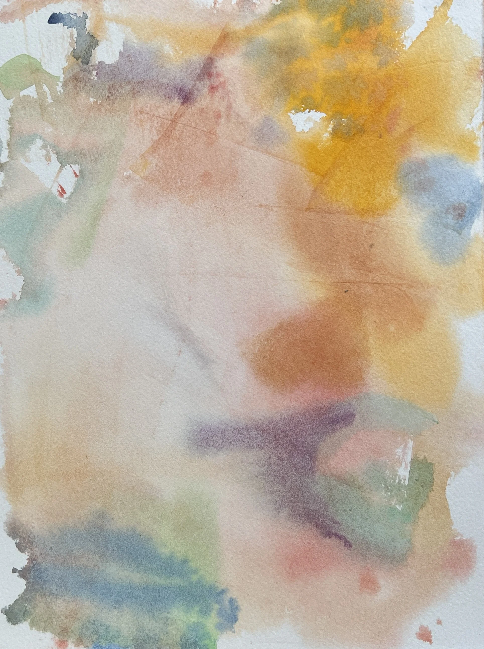
Pretty. Cool-dominate. But maybe too weak and pastel-like.
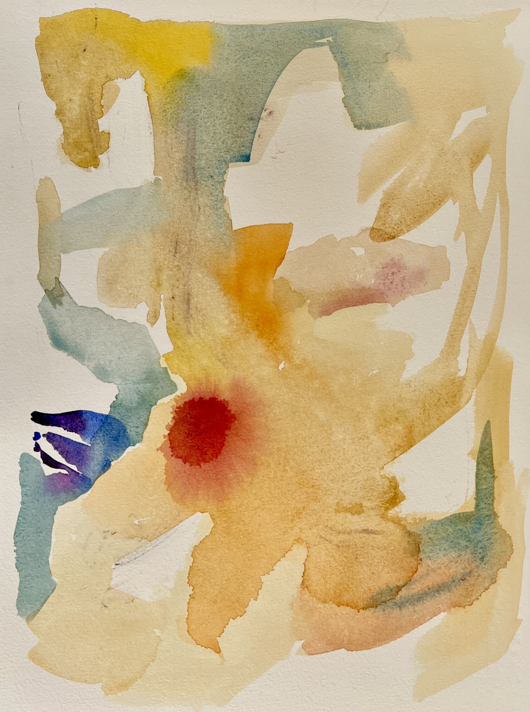
Leave plenty of white paper if you can. Notice the “blossoms” in the top.
Mostly soft edges. This could use a few more hard edges and white paper.
Strong, bold, hard-edged shapes can work but be careful. This underpainting approaches the limit.
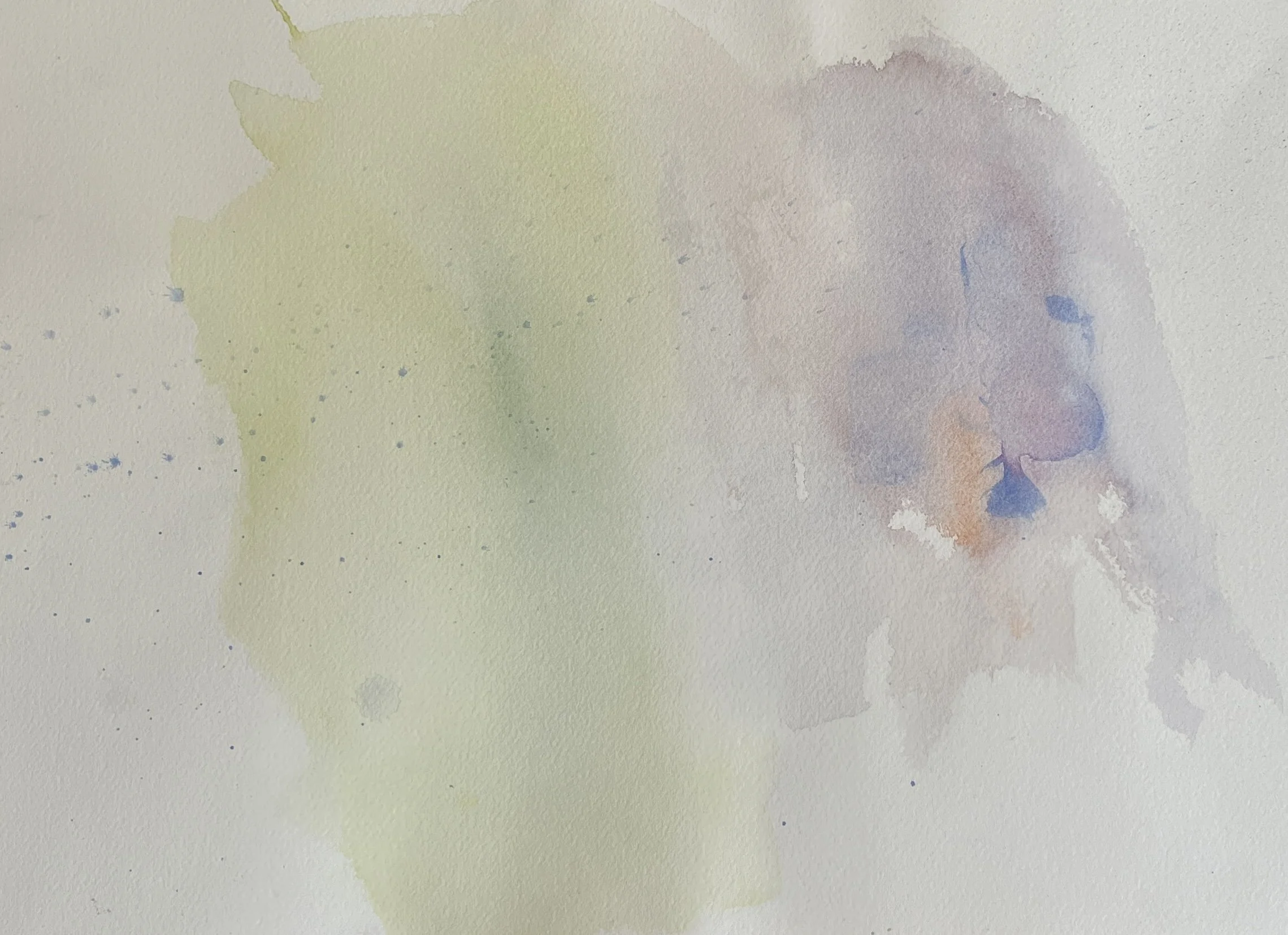
Interesting but too weak.